
 |
| Photo by Harpal Singh on Unsplash |
Few weeks ago while I was designing my app UI design, I found a library of icons and used for that project. It is not highly recognized as much as most libraries like The Noun Project, Orion and so many more.
I decided to share with you the experience with this resource. We will look at merits and demerits of this resource. But first let's look at the outline:
Pros
- Open source
- Minimalist icons
- Both fill and outline icons
- Copy from website into design
- Regular updates
- Easy website navigation
- Icons are categorized
Cons
- Icons are hard to edit
What is an icon library?
As a collection of different resources of meaning, an icon library is a collection of thousands icons stored together for designers and developers to use them in projects and works.
Out there there are tons of libraries for icons and it might be difficult to choose from them, Remix icon is among these library and we are going to take a look at its both sides and conclude whether we should use it or not, it might change your mind.
Pros of Remix Icon
1. Open source
Remix Icon is an open-source icons library, this means that you access thousands of icons on the website at no cost. Remix Icon is a library built by Remix Design, as the about shows it is an initiative of a designer and a developer; Jimmy Cheung and Wendy Gao respectively. For many small pocket designers this saves some bucks because you can get every single icon on this library free of charge and it is for everyone.

2. Minimalist icons
What I loved the most about Remix Icon is the way icons look in the design. I have liked that the icons look clean, very simple and elegant in a modern design shape. They have a modernized look that would trigger someone who's checking up on a design or product.

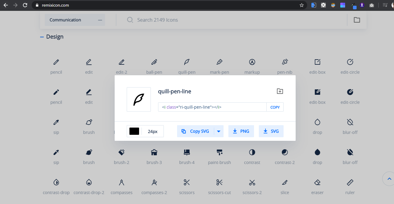
3. Fill and outline contents
Would you believe this? Every single icon in the library of Remix Icon has two versions, the fill and outline. Remix Icon has done all of the work for you, you don't need those maneuvers of changing the icon from fill to outline and vice versa, just locate the outline version and you are good to go.

If you are designing let's suppose an app UI, it's obvious that you will need some icons according to your idea. Remix Icon gives you an option to copy a specific icon directly from the web into your design environments, and this also works for developers.
N.B: Remix Icon has an option to download the library and own it if you like it.
5. Regular updates
Remix Icon updates its content regularly by adding new icons. Thanks to people behind this awesome idea, they keep Remix shining. That is a good thing about both users and owners because it makes the library very rich and competitive.

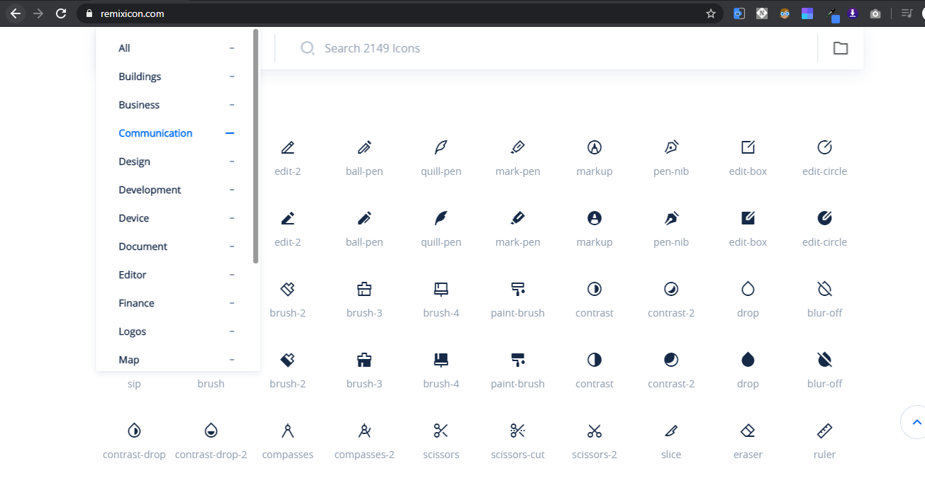
6. Easy website navigation
The thing I liked most on the first time in library is the structure, the website is easy to navigate. It is a one page website that contains all necessary information, that also hooked me up. No struggles encountered while I was looking around, it became so easy to understand the website functionalities.

7. Icons are categorized
As I said in the sixth point, the website of the library is easy to navigate. I can say that the way icons are categorized (grouped) makes the library easy to understand in a straightforward way.
This was about my views and notations about Remix Icon icons library, but I cannot say that everything was perfect a 100% and nothing seems to be unsatisfying. I have also realized some negative sides in this library.
Cons of Remix Icon
1. Icons are hard to edit
Icons of this library by appearance look like outlined but by nature they are not. For designers sometimes it becomes necessary to change the look of the icon, I can start with where it becomes necessary when I want to create an interaction it requires me to change the icon, so that's not an easy thing to do with Remix Icon's icons.
Final views and Conclusion
Throughout this article we have said so much to this library, we have understood what is an icon library and its function, but mainly said about Remix Icon. It is time to put it under review to see if we should take it or leave it considering all sides of view.
As a conclusion, after a clear consideration of all points stated above I suggest to take Remix Icon as a good icon library due to the following points; it is a rich library with minimalism both its content and itself and offers an easy way to take an icon from library into design environment.
You can try it to and put it on balance with other similar libraries out there.
Thank you for reading this post, was it helpful? If you have any suggestion of what to change in the post or what to write about in next posts to come, feel free to put it in comment, ciao!
)
1 Comments
I must give kudos to you, Leo. I'm not a developer so I must respect your knowledge on this terrain. Thanks for the enlightenment.
ReplyDelete